How To: Design Great Merchandise for Your Race
By Asianna Madsen
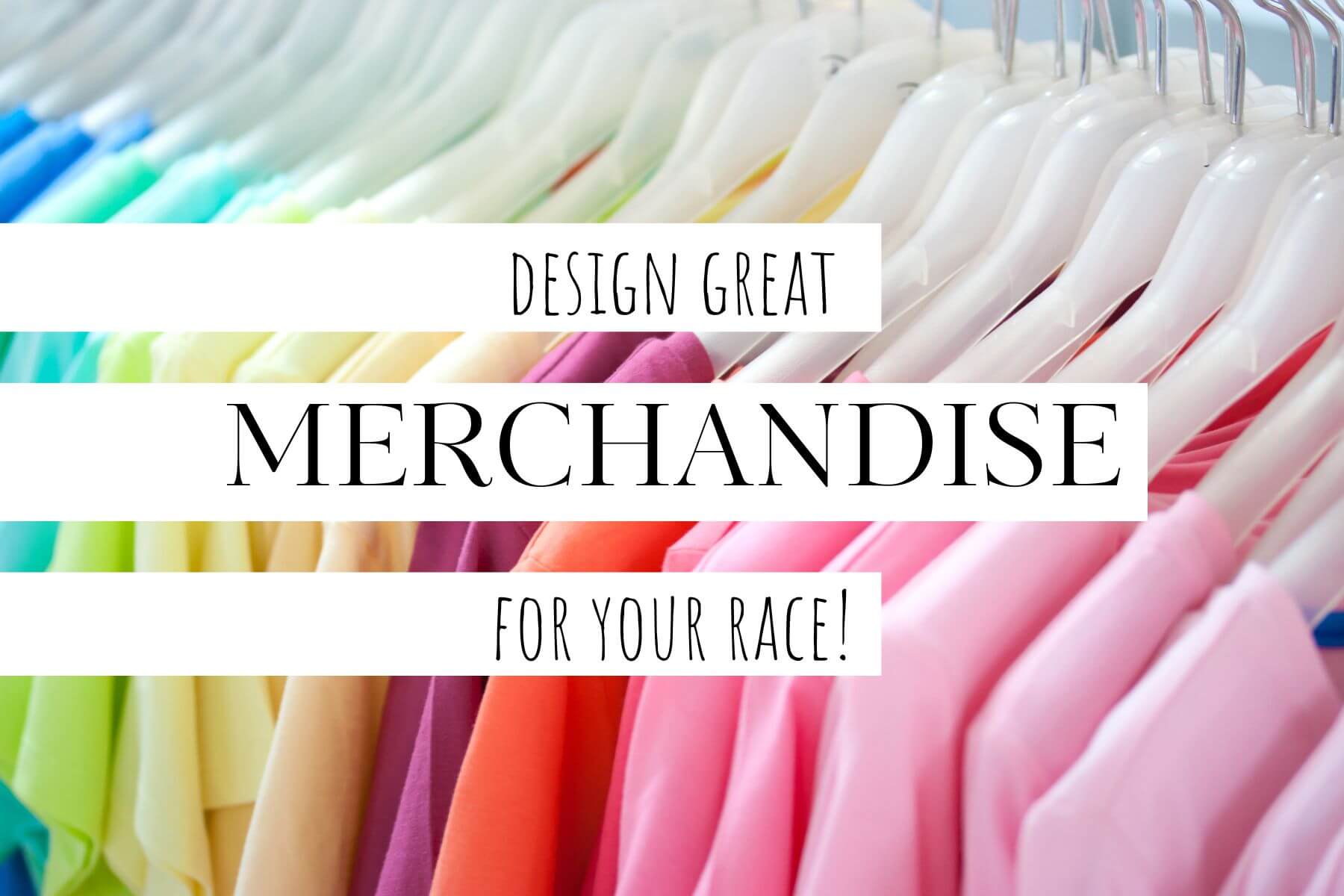
Merchandise is a great way to expand your marketing strategies and grow your race. Participants who buy T-shirts for your race are more likely to remember your event and spread the word. Every time someone wears your shirt, it’s free advertising for you!
Making effective merchandise hinges on having a good design. Whether you’re selling T-shirts, hats, water bottles or any other kind of merchandise for your race, you need people to like your product enough to use it regularly and show off your brand.
Knowing some basic design principles can help you sell merchandise that is unique, memorable, and effective in promoting your race.
If you don’t have design experience and have space in your budget, hiring a professional can help you deliver eye-catching designs for your runners.
However, if hiring a graphic designer isn’t within your budget or you want to tackle the design process yourself, here are some helpful design tips.
Choosing Colors for Your Design
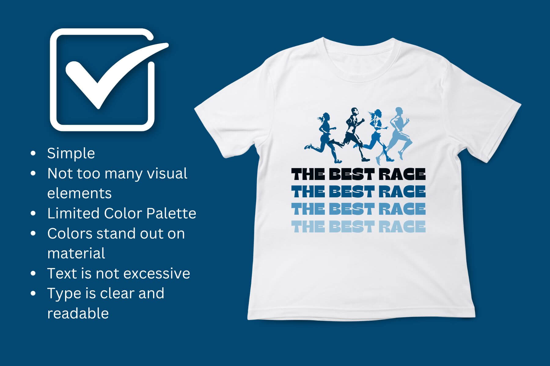
Color is an important design element. Your color palette affects the overall mood and tone of your product. For this reason, choose cohesive colors.
A cohesive color palette will enhance your design and make your product shine, while poor color choice distracts from your message and reduces the quality of your merchandise.
Use Your Brand Colors
If you already have a color palette for your race, using the same colors helps simplify the design process and strengthens your brand image.
Even if your merchandise doesn’t have the logo or name of your race, using the same colors as your logo will help people recognize your brand. This way, when someone sees your merchandise, they immediately recognize that it’s from your race.
Use a Color Generator
An online color palette generator is a great place to start if you don’t already have a color scheme or aren’t sure what colors to use. Even if you have an idea of what colors you want to use in your design, a generator can help you pick precise colors and tints that will go well together.
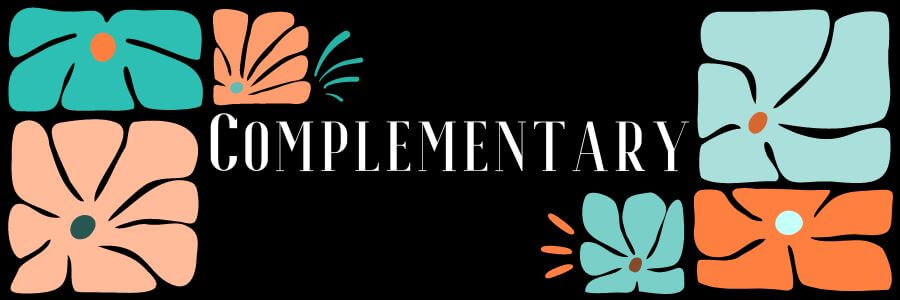
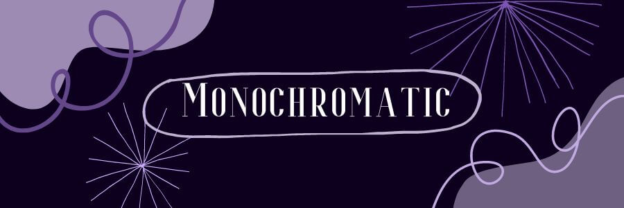
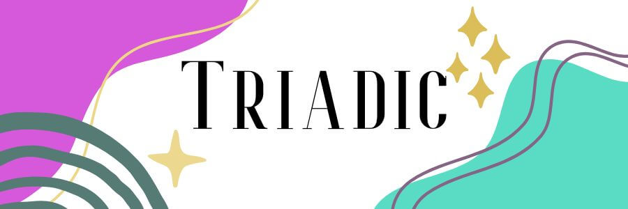
There are many free online tools that you can use to create cohesive color palettes. These tools will usually give you multiple types of color schemes to choose from, such as analogous, complementary, monochrome or triadic. You don’t necessarily need to know what all of these mean, just play around with it until you find a combination that you like!

Keep Your Color Palette Limited
A good rule of thumb is to pick two or three main colors for your design. These are the colors that you want to stand out and catch people’s attention. You can add other colors as well, but they should be neutral or desaturated colors that won’t steal the show.
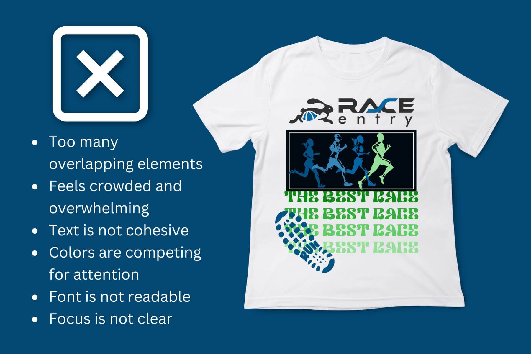
Using too many colors in your design makes it more likely that your colors will clash and compete with each other. Too many colors makes your design feel chaotic, overwhelming, or confusing.
Depending on your vendor, using more colors can also make it more expensive to produce your merchandise. Many T-shirt companies limit the number of colors you can print, or have an extra fee for adding more colors. Check with your merchandise provider before settling on your design. This way, you know if there are any color limitations before you pick your color palette.
Visualize Your Color Scheme on the Product Material
It’s important to remember that the color of your merchandise item is also part of the design. Make sure that the colors in your design will be both visible and appealing on the actual product material.
For example, if you are making a design to go on a black shirt, don’t use dark text or shapes in your design, because they won’t be visible. If you’re printing on colored shirts, you’ll need to make sure that the colors in your design won’t clash with the material color.
As a general rule, if your background/material color is a darker or more saturated color, choose white or lighter colors to go on top. If your background color is white or a lighter color, you can put black or darker, more vibrant colors on top.

Choose Colors Based on a Season or Mood
Choosing a warm, cool or neutral color scheme can help you come up with effective colors for your design.
If you need help coming up with colors to use for your design, try thinking about whether warm, cool or neutral colors will be more effective for the purpose of your design.
Different colors can create different moods or make people think of different things. You can combine warm, cool and neutral elements into your design, but it’s helpful to consider the effect that certain colors will have in your design.
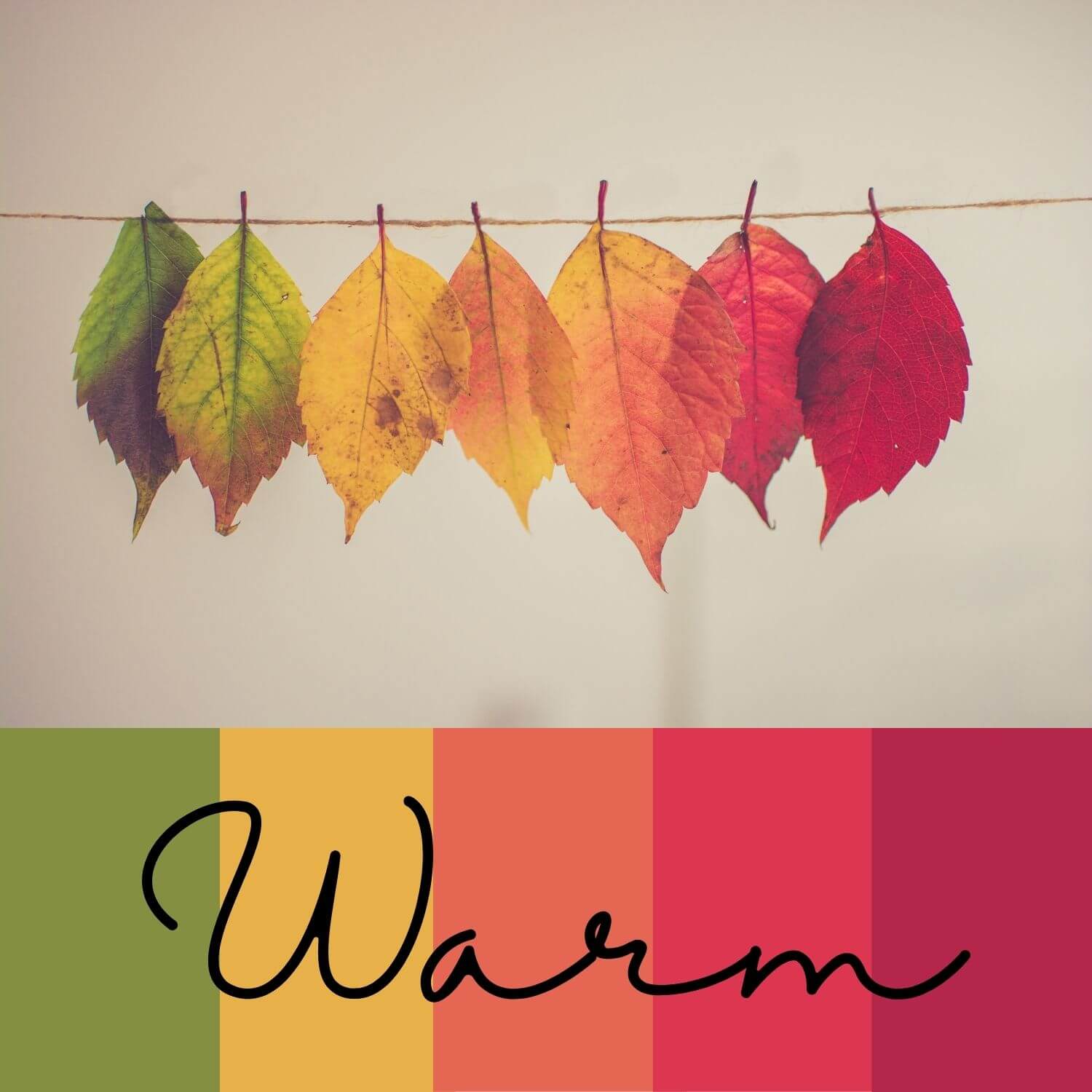 Warm colors - Red, orange and yellow are considered warm colors. Warm color schemes can make your design feel energetic, positive and sunny. These are good colors to use if you want to theme your design towards autumn or any sort of physical heat. Warm colors can also be used to evoke excitement in certain situations. For example, a marathon shirt that says “I Finished!” might use bright red or yellow text to show the energy of that statement. If you want to add an urgent feeling to your design or quickly catch people’s attention, using warm colors can help do that.
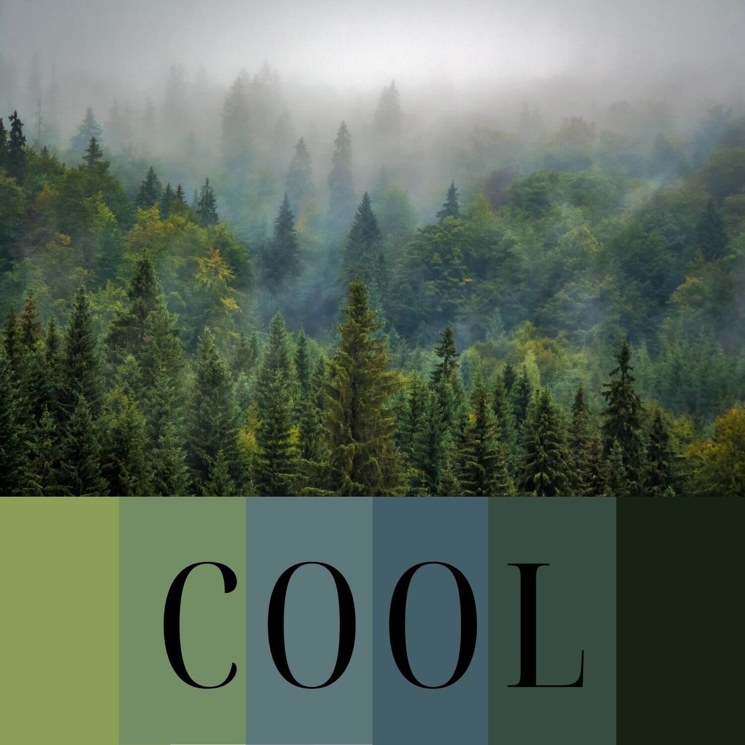 Cool colors - Green, blue and purple are cool colors. They tend to evoke feelings of cold, calm or relaxation. These colors also remind people of nature or the outdoors. Greens make people think of trees or plants, and blues make people think of water or the sky. Using blues and greens can create an outdoor or summer theme, while blues and purples can create a winter theme.
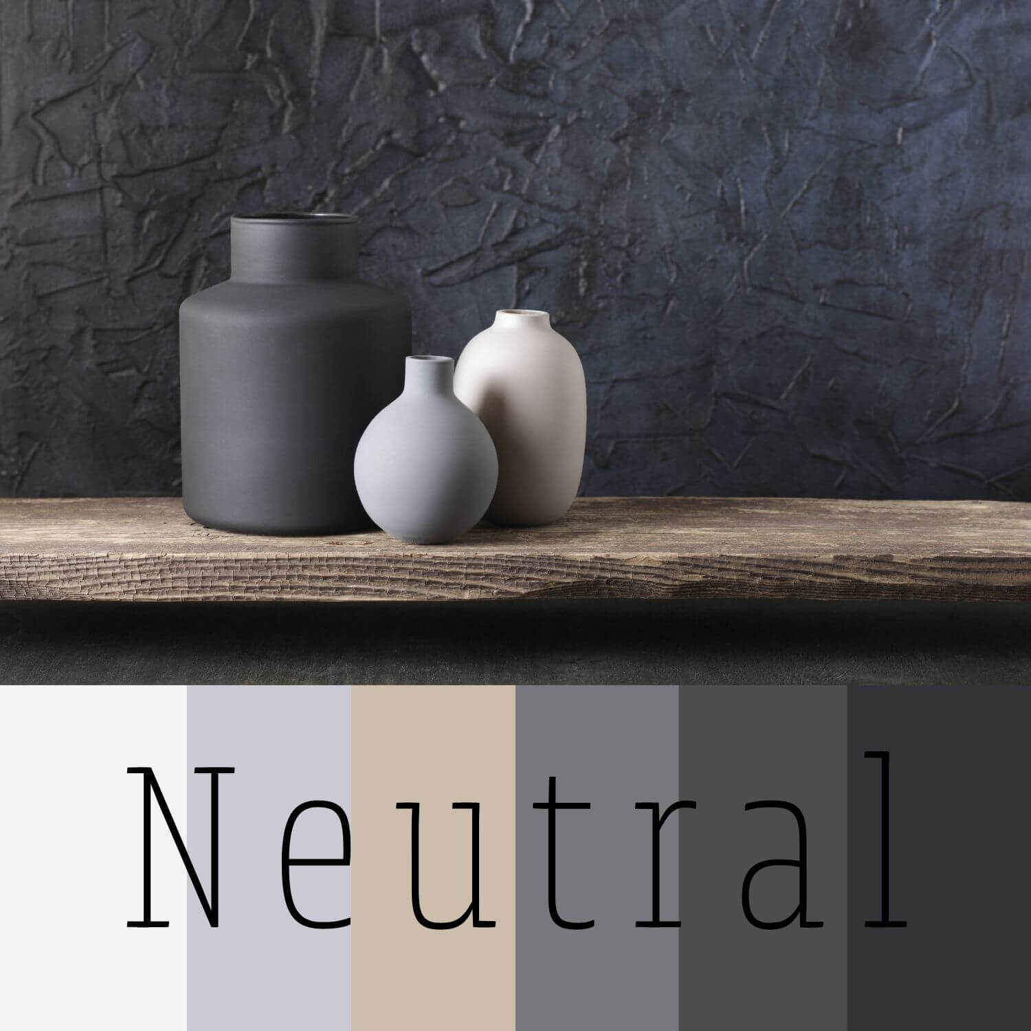 Neutral Colors - White, black, gray and brown are usually considered neutral colors. These colors can help balance and support your main or accent colors. If you find that certain elements of your design are clashing, try adding a neutral color to create space and contrast between competing colors. Neutral colors are also a good choice for any text in your design, as they are often more readable than other colors.
Effective Typography
Many T-shirts and other merchandise include typography along with images and graphics. In fact, some of the best T-shirts are text-only designs. Whether or not the text in your design is the main focus, it’s important to get your typography right.
Any text in your design needs to be easily readable as well as aesthetically pleasing. When people see your merchandise they should immediately know what it says and how it goes with the rest of your design.
Avoid Excessive Text
Your design needs to be readable and coherent at the first glance. Having too many words can make this difficult. Excessive text can also make your design feel crowded, overwhelming and confusing.
In order to not confuse the reader of your design, only add as much text as is necessary. This might be the name of your race or a short slogan. In either case, short, simple words and phrases are usually the most effective choice for a design.
Choose a Readable and Cohesive Font
The font of your text should be easy to read and match the style of your merchandise. Font affects your overall design. Do you want your design to feel formal, professional, fancy, friendly, playful or casual? Your design’s mood can help determine the font that you use.
The main font types are serif, sans-serif and script. Match your design’s style and goals when choosing a font.
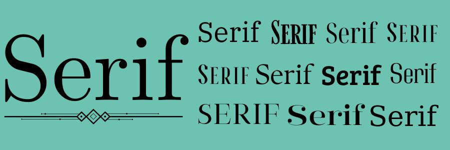 Serif Fonts - Serif fonts are the standard font type used in long-form text like books or magazines. Use a serif font for a classical or professional design appearance.
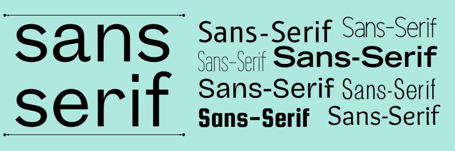 Sans-Serif Fonts - Sans-Serif fonts are the standard font type for digital text. These fonts are simple, clean, and more legible, especially on screens. Use a sans-serif font for a professional or modern look.
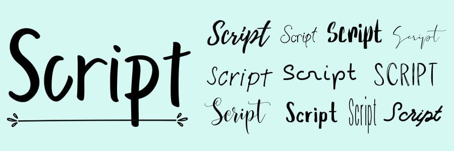 Script Fonts - Script fonts mimic actual handwriting, ranging from casual to formal, cursive to handwritten, and simple to complex. Script fonts add personality to your design. They can also help your text feel familiar, friendly, nostalgic, fancy, formal, or playful. However, script fonts can often make your text less clear and readable. Just be careful that your text is still easily readable!
Even after you pick a font type, test how different fonts look in your design. Most design programs have hundreds of fonts available, so it can take some time to find the perfect one. However, choosing the right font can be the difference between a good design and a great design, so be patient!
Place Your Text Where it Doesn’t Interfere with the Design
Consider the size and placement of your text. It’s easy to overlook text size and placement, but they play a big role in your overall design.
Try a few different placements before settling on the best spot for your text. Consider aligning your text to the left, right, top, bottom, or spacing it across the full design space. For many designs, centered text might be the simplest choice.
The placement of your text shouldn’t interfere with any other design elements. Text shouldn’t overlap any crucial parts of images or graphics, or crowd your images. Overlapping too many elements also makes it too difficult to read your text and understand what’s going on in your design.
Important Text Should be the Largest
Ensure your text is large enough to read. It also needs to fit well in your design space. Text size is another factor that can crowd your design if you’re not careful.
You can vary the typography size. Remember that font size affects how quickly people look at it. People see the largest elements first, so your most important text should be the largest. If you’re including longer text that is less important, make it smaller to fit the space.
Understand Your Usable Space
Whatever kind of merchandise you’re designing, plan how your design will fit on the actual product. Every type of product has a certain amount of space that can be customized. This is what’s considered your usable space.
For example, when you design a t-shirt, you’ll decide whether your design will go on the front, back, collar, or sleeves. Depending on where you’re getting your T-shirts printed, you can select one or more of these spaces for your custom design.
You also need to decide how much of the usable space you want to cover. You can make a full-torso design that covers the full front or back of the shirt, or have a smaller, chest-centered design that takes up less space. A full-torso design works well for full images, with or without text. A chest-centered design works nicely for text-only designs or for a simple logo.
Usable space differs with other types of merchandise. Consider putting a logo or design on a water bottle. Text that wraps around the entire water bottle may be hard to read, so it may be better to have it down one side.
For smaller merchandise items, simplify your design to use only your brand name or logo rather than including both text and images.
Avoid Crowding Your Design
Size and placement of text isn’t the only thing that can crowd your design. Also be careful that you don’t use too many visual elements. Placing a lot of images or graphics close together makes your design confusing and chaotic.
Negative space in a design is the white or blank space where you aren’t adding customization. It’s important to have some negative space between different elements in your design. This makes your merchandise stand out and look professional.
Amateur designers often think that they have to cover every inch of space in order to make interesting products, but this isn’t the case! Use negative space to your advantage. Spacing out the elements in your design makes it more readable, organized, and appealing.
Exporting High Quality Images
A good design needs high resolution. Resolution refers to how much detail is shown in an image. The quality is determined by how many pixels are in the image. Images with a higher resolution have better quality, but also take up more storage space.
Below we cover how to get high quality images and which file types to use.
Only Use High Resolution Images
When downloading photos or images to use in your design, choose high resolution images. The larger the image size, the better quality it will have. As a general rule, only use large images (at least 1,000 pixels wide) when downloading images from the internet.
Export Your Design at 300 PPI
Once you’ve made your design, make sure you export and save it correctly to maintain the quality of your work.
In general, you save your images at 300 ppi (pixels per inch) for the best quality and resolution. In some cases, you can reduce the resolution to accommodate a smaller upload size. You can go as low as 150 ppi or even 72 ppi for very large images.
Know What File Type to Use
In some cases, file type doesn’t matter. Other times, it does. So, here’s what you need to know about the different options.
For images, your main file formats are JPG (can also be referred to as JPEG) or PNG.
JPG/JPEG - This is a standard file format for most images, especially photographs. JPGs work well when you need to save on storage space or keep your upload size small. JPGs use what’s called “lossy” or “irreversible” compression, which can lower the image quality. This kind of compression is useful for photos, but not ideal for some graphics and illustrations.
JPGs don’t support transparency. So, when you design an image with a transparent background, a JPG will automatically fill in the background with a standard color, usually white.
PNG - In many cases, PNG files are best for saving your graphics. PNGs use what’s called “lossless” or “reversible” compression. This means that you can compress your image to a smaller resolution without permanently losing the image quality. However, this format will still take up more storage space than a JPG.
PNGs also support transparency, so it’s the best option for anything with a transparent background, like logos. Just keep in mind that not all softwares will allow PNG uploads or exports.
Some sites and programs may only accept certain file types, so be sure to check the requirements before exporting your image.
A lot of things go into creating a great design: color choice, font style, and text placement greatly affect the overall appearance of merchandise. Once you’ve made your design, export it correctly for a high-quality product. Making your design cohesive, readable, and eye-catching is the best way to sell your products.
Now that you know what makes a good design, get creative and have fun with it!